So, I wasn't terribly surprised to find this home referred to as an example of the Edwardian period:
[all photos by John Gollings via Contemporist]
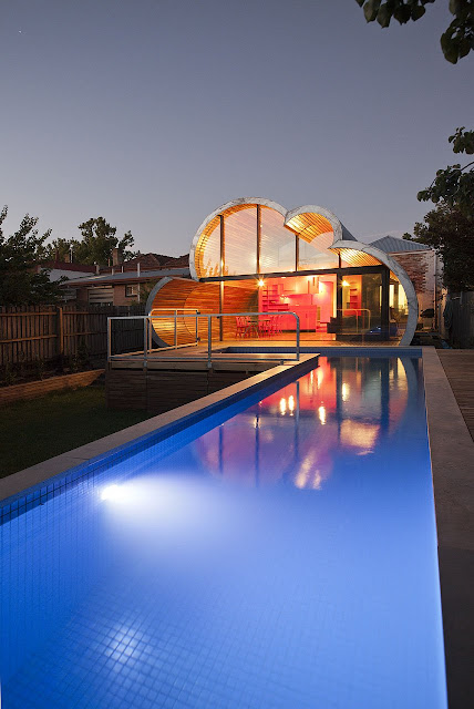
Now, here's the kicker: What if I were to tell you that these are two facades of the same house?
In order to link the seemingly opposed elements, McBride undertook the design in three parts, allowing "for a sequence of distinct and unexpected episodes, with glimpses previewing oncoming spaces and experiences as you move through the home," he wrote.
Starting from the front of the house, the spaces inside the original building are mostly white, accented with a bold floral carpet. This leads to the second space, a disembodied red box that houses the kitchen and links the Edwardian and modern sections of the home.
Finally, you come upon the fluffy, cloud-shaped addition in which floor, walls and ceiling blend together seamlessly to form the home's common area.
So, I try to give you Edwardian and I veer into uber-modernity. Would you expect anything less of me?


Never even heard of Edwardian architecture....but I sure do likie ah loh. So fun!
ReplyDeletewow this one is so cool! I love the woodwork, its like a dream!
ReplyDeleteTotally did not expect this at.all! WOWsers! What an interesting development? The pool looks good though, I could one right about now in this heat!
ReplyDeleteHope all is well with you!
x.o.x.o
Wow! I'm not so much a fan looking at it from the front but from the back where you can see the cloud design it looks really cool the interior looks cool as well.
ReplyDelete